Tuesday, 12 April 2011

Evaluation

Evaluation of my 12 Weeks:

Modelling:

Week one was definitely one of the hardest weeks I had in my whole course, together along with the class we was chucked into a brand new program environment. Starting from simple shapes to an insight into what we will be making in 6/12 weeks’ time, daunting to say the least.
I began to try and master the program in the first lesson by making Taj Mahal why everyone else built an American ‘Whitehouse’ (which I thought I could) but this wasn’t going to happen. After the first week; I was determined to know more about this program. 

After the first few days I jumped straight onto the ‘educational’ version of 3DS Max that I downloaded and begun searching the internet for something to do. As the project brief was a James Bond trailer, and I had chosen Casino Royale, a poker chip was born! After learning how to apply my first ever material and how to ‘UVWMap’ through YouTube tutorials, soon after there was detail and my very Photoshop images on the chip. Now I was beginning to feel more comfortable.

As time followed in the upcoming weeks, more and more complex objects were being built, along with a gun, a poker table, a bullet and a watch by time it had reached week 6. All of my models were completed and finished.

Animation:

As Week 6 was done; relief sank in, however I needed to animate them. This wasn’t going to be easy at all. As the weeks went on we learned a lot about daylight settings, camera movement, target cameras, free cameras and movement in the ‘noise’ parameters of 3DS max to animate my water that I had used and by setting the time line from 1-100 with different noise parameters in auto-key had changed the settings to animate automatically. Thanks to my tutors help it looks great. 

The Animation took a new form when in week 11 I thought of an Idea of using wireframes as well as my models animated to add a new ‘James bond spy’ effect. This was visually pleasing and very good. Animating the wireframe and everything was exactly as how I wanted when it rendered. Premier Pro done a good job when scaling it to frame size and was everything I was after. I used simple Opacity transitions from scene to scene and stole a few sound clips from youtube.com. Which I think is fine as I couldn’t make this myself; these clips were free to download by the artists. 

After my animation was finished, playback was done and after watching it and it reaching 27 seconds, I added my SID Number at the end and the change in sounds. I do like my animation and my finished render; it’s a shame I didn’t have more time as I feel on 3DS max over a span of say 20 weeks, everything could have been improved and my learning curve would have been even greater and steeper. Thank you too rich for his help and to my fellow classmates, as for when I missed a few classes, they were the ones who helped me catch up. Overall this was an interesting and great assignment, which I think I completed to a high level.

Late Boning Screenshot

I had found a screenshot that I have not uploaded of the boned hand. This is there to pull the trigger on the gun and make it seem realistic, however if it isnt boned it will not look good pulling the trigger and will not look REAL. However thanks to the boning tool and connecting it to my turbo smoothed hand. It couldn't have looked any smoother..

Here is the screenshot of the hand boned and ready for use:


Monday, 11 April 2011

Finished Trailer - AVE IT!


This is my finished trailer for my James Bond Assignment. I am very happy with this and will most likely evaluate tonight. It its now 8.45 and I have been here since 10am, so I think I deserve my rest!

Will continue the blog later on.

Scanline Additions!

Ive now thought of a very 'James Bond' secret agent type effect using a scanline. Which at the moment looks pretty damn good! Im really really really really happy with this and this is my favourite effect that I have done so far..

Definitely a favorite! Have a look at the PNG that I have made. 


Cheeky Preview..


Below is a snippet of where I am right now on editing on premier pro. My gun is now involved with the hand and the hand being successfully boned. The editing style with the wire frame works perfectly and is exactly how I wanted it to be; having this in my trailor means my storyboard and my movie are not accurate. However this is part of the editing process and although I'm disappointed it didn't go to plan. I feel like I have made a more positive impact by doing this.

They're currently gaps in the clip of black space, this is where I am still rendering to fit my scenes in. I would like to finish this today for rich to say in our very last class tomorrow, Tuesday 12th April 2011.

Premier Pro - Finish line is in sight..


Im now editing in premier pro and have the majority of my renders to put together and finish. Only a few more which will be through some of my very earlier renders. I have decided as putting the clips together that my story board isn't going to go to plan As I havent made Martini Glass yet and still have to model that scene. I believe that it may a be a possibility for me not to have it, but hopefully if I have time I will.

I'm happy with a lot of my renders and my techniques. I Think when in premier pro they will work well and hopefully will go well with the music that I have chosen. Which is the original sound track from James bond, casino royale. So far so good! Hopefully no Hic-ups!

James Bond Style Renders

Im currently rendering a sequence to make it look james bond and have a 'scanning' type effect when put into the editing software.

I didnt really know on how to do this so in the end I found a very clever wireframe render tutorial and used that to render my whole scene again. Link can be found here: http://www.youtube.com/watch?v=x6BFT3S1zo4. 

This is great for my scene - it doesn't match my storyline but I think it will be a great effect in the final trailor... Especially if I use it on a title sequence. 


Monday, 4 April 2011

A Rendered Film


This is the rendered clip - I have two versions, one that is double the length and is good for editing on premier pro / after effects.

A Week in a Day

As I said in my previous post - last week. I will put aside Modelling this week and concentrate on other modules while some of my work renders.

I have put together below A list of images and I will then comment on them further below.


Roof Tiling is something that was very easy and was done by a downloadable texture that I saved from google. The Roof shape is something thats very simple and also just repeated across the top. This was the start of my city of venice.


 Almost imediately I began on the buildings and constructed several simple cuboid shapes to resemble the city of venice! I was getting there swiftly. I used a simple water tutorial at this point and created windows in the buildings so it would reflect the water. 100% Relfection plays a good treat when reflecting opposite or the other buildings.


The buildings were being stretched and multiplied and I was beginning to feel very doubtful of my project of venice so far. This is dissapointing for me as I felt I was 100% comfortable in the program of 3DS Max. Obviously not! I wasn't happy with this So I decided to scrap it and begin again. While re-starting my city I was searching the internet for ideas and came across a 3DS Max website which had loads of venice related articles on how to build a city. With finished downloadable files on it. (I will explain this later on in the blog).


Water - My original water I made wasnt very good and I felt this insulted what I was capable of on 3DS max, whether you follow a tutorial or not. Everything is a learning curve!  I found a tutorial on the internet which literally created the perfect ocean for me and successsfuly using daylight settings that rich taugh us very early on in the Modelling side of this module.

http://www.freeitsolutions.com/3ds/viewTutorial.aspx?id=4129

The link can be found above and is a very good tutorial on creating exceptionally good water. This Ocean was spot on and perfect for just popping the buildings on! Once I had a great plain persay, the rest would follow!


Now here's the venice part. Considering it is week 11 and the most important part of the module at the moment is animation. I would like to reference these venice buildings to this:

http://www.turbosquid.com/3d-models/free-aria-buildings-3d-model/368820

However I had modified and changed the buildings completely, But i did not originally create these, however it doesn't effect that I feel I WOULD have the ability too. The buildings are made out of an editable mesh and the windows and archway's, roofs are very easily created.

Unfortunately I do not have the time - however If you were too look at the link above and my current city, they're very different in a lot of aspects and are somwhat compeltely different. I have edited the whole scene just for a small section of filiming.


As seen above this is one single frame rendered. This is 1080HDTV, 1920x1080. I will be rendering all my films and movies in this ratio and at this size so everything is at a high quality - no materials will lose quality and some 'grain' like problems which can occur. Which can be easily fixed by rendering at a higher quality. 

It may take longer - BUT thats what over night rendering is there for.

It will post again with the rendered clip that took a day and a half to render (most likely due to daylight/environment settings).

Tuesday, 22 March 2011

Hand Start

I have just been getting on with my hand on for 3DS Max - With a little help from rich on editing the edges and connected a few things together, simple stuff but sometimes you skip to ahead!

Here is the stage I am at, I will be dedicating this next week to my other modules as I will be doing a lot of rendering this week, so there will not be many post's. However the week after that will be nothing but post's premier pro screen shots and much more.

The hand is going to be based on the style that is used for the introduction for casino royale, very blocky. The hand is no where near finished! The effect I'm going for can be found here:

http://www.youtube.com/watch?v=Nfc9GLxlhEw


Creating the Hand - New Technique Learned

Here I am creating the hand that is going to wrap round my gun. This gun is will be fiiring and I need a realistic yet silhouette looking hand, I will be using boneing in the object aswell to use some of the techniques that richard has taught us, and to make my life easier!

I have just learned another small technique for creating the fingers, using the extrude tool I can extrude by polygon on the settings tool and extrude all the fingers at once. This is quicker and will most likely save me around 15minutes! More time saved! :D


Morphing The Heads


In this tutorial with rich we used the morphing modifier and other copied heads of the same object to animate a moving expressing head. This is a great tool for anything that needs to be moved at the same time as others. 

I have a feeling I will be using the modifier tool for many things in the future as animating is now the dominant task at hand! This tool in a way reminds me of tweening in Adobe Flash, in is something that I find very similiar. 

I am now going to start rendering some of my clips in 3DS Max...

Tuesday, 8 March 2011

Animation and Timeline


Balls bouncing, using the timeline for the first time in class and having them bounce and be realistic by editing the curves in the Graph Editors. Animating is complex but I can't wait to get on it and animate my scenes in class.

It may seem quick but thats due to the size of the video, in the program and in the avi file it is a lot more smooth.

Monday, 28 February 2011

Watch Rendered

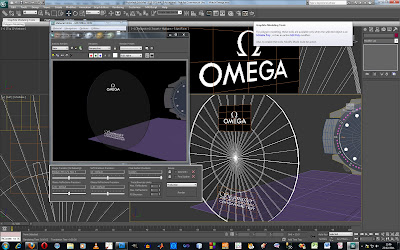
Omega Watch - 


Just rendered the watch and completed the links that need to be done for it. I personally think this is finished. The watch isn't too great when looking at the back but you can see all the links are linked with small screws and they all work really well with the material thats been applied. 

I will only be displaying the watch from this view. Ultimately I am very happy with this. I will now begin making my aston martin keys.


Wednesday, 23 February 2011

Second, Minute And Hour.

Here is the second, minute and hour hand finished along with the detail around the egdge of the watch, (internal, not external!) The dash's to represt minutes and the dots along with the outside being a plain colour as seen in the watch here:

http://www.omegawallpaper.com/seamaster/omegaBOND1654x1489.jpg

Ive used ideas from this watch and tried to copy it as closesly as possible, but without a plane to work on it is quite difficult as this is all from eye. So far Im happy and really want to get this done by 5pm so I can start on the next model or atleast finish the links today! 

Here is the new image update:


Watch Turbo Smoothed and changed

I decided to turbo smooth the edges of my watch to get the perfect circle edge that surrounded the face. It turbo smoothed PERFECT, and was exactly what I was after... However... All the dots and lines for second and minute markings around the edge of it were completely messed up. So to ensure that I wanted the turbo smoothed edge in my design, Ive spent the last two hours moving, re-angling all the bits of the watch. I well and truely tidious job, But It looks a lot better.

Here it is:

Omega Watch Continued...

As my rugby match was called off due to weather conditions, I had a lot of time and figured I would put it into my watch for my 3DS module. I have been working on a few more little details on the watch face and havent started the links yet. The face of the watch is getting there and thanks to UVWMapping I am now able to input some of my textures, numbers and logos that I have made in photoshop into the watch. By adjusting the bump tool to a very high 150, to make them seem more embossed.

Overall I have made small circles etc and will be making new hands for my watch, this is the stage I am at, at the moment.


Tuesday, 22 February 2011

Omega Watch

Im now on my design of a watch - The most famous watch that is in James Bond which is made by Omega. I don't feel like there is much to be said at the moment Other than me using small shapes and simple designs and ideas to get where I am. I did with some help from rich make a glass pane for the watch that will reflect anything that is next to it. This gives it the sense of realism and is exactly what I am after. Other than that, just editting the poly's and everything else to get where I am on this watch, I really do want this watch to be as detailed and as a good as possible. 


Monday, 21 February 2011

James Bond Comic Instead of Storyboard

James bond comic - Well, after being bored on monday evening I have decided to change my storyboards and to put them into a readable comic. After all I think this is a good choice to slam a bit of my own creativity into the project and to not only make it more interesting for myself but to make it more interesting for the tutor. This is the front cover that I made by doing vectors, and believe it or not all of the james bond character is done with the pen tool on photoshop, bit by bit. Overall I ended on over 250 different shapes. Not bad for an hours work I believe and shows a good twist and hopefully putting the project on its edge. The Barcode and the 'edition 1' are just there for visual purposes to make it look good. 

I will be making the rest of the comic (storyboard) as a A3 Piece of work which will be folded to make a 2 page spread storyboard, with front cover, story and back cover. ( The Poker chips were stolen form deviant art; Im definitely not taking credit for them! )

Friday, 18 February 2011

Poker Chips in Action

Poker Chips have been put on the table now and by using a target light above it, It has a very good dark poker atmosphere to it.. I have put the poker chips into different stacks on the table and have placed them next dickhead to every seat on the table. 


Poker Chips Finished and Rendered

Here is a screenshot of them finished and rendered:

Poker Chip Madness

Poker Chips are being edited and coloured and duplicated in 3DS Max. I originally made a plain black poker chip in my first week of 3DS Max. I Am now creating seperate stacks and then grouping them together. As controlling every poker chip in the scene will be way to time consuming and sloopy.

I have made 5 colours, blue, green, yellow, black and red. Here in this screen shot there is 3 Stacks of each colour. I can chop and change the stacks round as I want, although the chips in some stacks will be the same size, this will trick the audience into thinking there is different totals for each seat/person. These chips are being placed on my casino table and will give it the edge when needed. My next task is either a martini glass or a roulette wheel. 

But im slowly getting somewhere now, still a long way to go!


Thursday, 17 February 2011

Lock & Load!


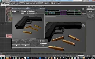
The images you see above are a good couple hours work for my bulletts in 3DS Max - Any tutorials i was looking for online were very hard to be able to make the bullet shape, then I remembered as rich taught us the lathe tool. The lathe tool was used to create a shape ona  360 degrees, so I gave the bullett a try, opened up illustrator and luckily it worked!

The bullet was created, but the textures on there wasnt. I had to make the gold texture on the bullets from a text tutorial that I found on the internet, It has a high refelction and is using a multi-layer material, After crossing over lots of copper-like colours. I came across the way its looking now, straight after that I moved on to picking the polygons and then setting a darker version of the colour that I had already used and used the 'assign material to selection' button.

By putting the darker colours at the end and the middle breaks down the gold and makes it, what I would like to think very very bullet like. After that I had turbo smoothed the bullet. Then Finished!

Tuesday, 15 February 2011

Gun Final

When in the lesson today, I started making my gun for the model hand in for week six, I started with the top section and then slowly began adding materials, fine detail and the barrell. It took very long and I have been making this model from 10am through till half 4, I have now finished my first model.

This is of a Waltham 99, A very important and prestigous gun in 007. Anywho here is where I am at:


Daylight Test

I used the tutorial here that rich posted on his blog:
http://www.youtube.com/watch?v=RnM-S_waF0M

And followed it step by step to learn how to use the daylight tool, This is great and creates a 'natural light' feeling which is great for anything that is outside. My renderd image can be seen below:


Using metal and chrome settings with the daylight tool is very good as it shows reflections within the material/object.

Light Manipulation


Including Light or excluding ligh - This was done straight after and was another short turotorial taught by rich, having the power to control one objects brightness is very important and is exactly what i think I will end up using a lot. Here in the images you can see two seperate versions of the light control. Before and After render.

Pumpkin Tutorial


Today In class we were working with lights and made a spotlight and a omni light. I used a pumpkin that Rich had previously made (I think). We then moved on to using omni light inside the pumpking and a directlight behind it with a large gap between foglight and direct light.

After increasing the noise we were able to change how it looks, It gives an impressive smoke effect. I think my pumpkin came out very well and I am pleased wth it! Every week im learning a new skill and getting more and more adapt in this program.

Tuesday, 8 February 2011


Just made a poker table and chairs and after using turbo smooth, it now makes my environment ten times better and gives it the edge that im after. I will be putting in walls and making more of the environment so when animating, If I wish to move the camera in any way shape or form then I wont have black space, or I wont have anything in the background that I wont like. At this stage im very happy about my modelling and the rate of production that im knocking out :) 


Casino Royale Table


Here we have my poker table on 3DS Max rendered to show the image and the dice that have been made. I made the logo in photoshop and then used UVW mapping and Gizmo which I learned in the second tutorial. Also adapting the noise material in photoshop work realistically as a carpet like material when using the bump tool again in the material editor.

Very happy with this table so far!!


Dice design


My design of my dice was done in photoshop and then by using the uvwmapping tool i was able to wrap it round my cube to make the die complete. I then duplicated it after resizing the dice to the correct size of the table to make it 'dice'. I used the bevel and emboss, drop shadow tool and outer flow tool in photoshop to make the white circles not seem so bland.

While in 3DS Studio max I was able to make the white circles dip in using the bump tool, but setting the bump tool to -30 instead of +30. Thus controlling the direction of the emboss, Im very happy with my dice and feel that I have learned a new tool thanks to rich's help.

My dice will now sit ccomfortably on my poker table.

 See Dice Below:


I woke up late!


In my most recent tutorial with rich we done a leaf and this is my finished model. It took me just under 25 minutes to work out how to use a few more tools. A lot longer than I anticipated. I woke up late and come into class late as my alarm didnt work, but put in the effort to have a finished leaf. Which I am proud of! I used the soft selection tool and masking in 3DS Max, Great tool and has really helped me! I also used the 'bump' tool.

Here is my finished leaf rendered:


Larger scale:


Other leaves:

Tuesday, 1 February 2011

3DS Tank

I have made a tank as rich asked in 3DS Max in just under an hour and this is what it is at the moment. There could be a lot more detail and small objects involved but i decided to leave it here as I feel like I have givne enough depth of knowledge using the plain and I have realised how much better things are when using a plane. It gives you accurate readings and allows you to make things more realistic and precise.

I can feel myself using planes constantly throughout the next 6 weeks to make everything perfect! :)

Reference Planes

In class I learned on how to import and make my first reference planes for a tank. I used a number of techniques from importing a a GIF image and editing the image on a plane using the UVWMap tool.

I was able to move the image around the plane and make it fit to scale. I saw in richards pictures on the blog on how he had a vertical and horizontal plane. I then cloned the image and rotated it round to make the plane for the vertical one and move the 'UVWMap' around ( the image ) to make it to the correct view. The techniques that I am learning in class today will be very useful when making the objects needed for my animation and my models.

Spring/Wire

I have just created a wire/spring using the loft tool and once again I am impressed by the program. I have learned very simple things and I am beginning to feel very confident on the program. I have made a simple string and used a circle to decided its width and radius of the spring.

In the screenshots will show my finished one, how it was made using the helix and the render.


Chess Piece

I have just used the lathe tool for the first time in 3DS Max and have made a pawn. A good chesspiece, I am happy with this and simply made it look similar to richards by copy and pasting his picture into illustrator and drawing round that instead of doing it freehand. I do realise the importance of other programes in Autodesk 3DS max now and can see the power of illustrator, photoshop etc.


Friday, 28 January 2011

Poker Chip Design


Poker chip's first design on 3DS Max - Used a simple round sphere increased its height and made sure it's width and depth were set to the correct and identical measurements.


After I had cloned the chip's sphere and used the polygon tool to connect them together, I made them solid shapes and then increased its height and colour. This gives the poker chip depth and more realism.

This is the poker chip design that I made on photoshop and while importing into 3DS Max from youtube tutorials, I found it slightly difficult but caught the hang of it in the end, I decided just the 007 looked good on the poker chip in the end and stuck with that. (see below).


This is my finished poker chip and I have added 4 separate materials on it to make it more realistic. This is black poker chip and would be of high value on my poker table that I will be doing soon. This chip has been designed in a way where the raised ages (see above posts) can be slotted in to the parts that are not raised. Technically make the chips perfectly stackable in 3DS and will look good as the white edges will not be perfectly aligned. Which wouldn't be ever in real life. The dots(materials) applied to the poker chip are what are actually on real poker chips as I believe they are made out of recyclable plastic or wood chips, or both.

This is the stage I am, I will probably rest for the weekend.